
This article gives some insights into the latest #FridayData post from Sykes Cottages' CEO Graham Donaghue. I'm hoping the article is equally interesting for both football and data fanatics.
About Sykes
The data and techniques shared in this article were produced by the development team at Sykes. We have used a combination of various open source technology including ChartJS, PHP, GIMP and SQL. If you are a talented Data Scientist, Analyst or Developer please check out our current vacancies.
Context
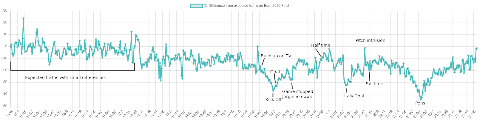
England making it to the final of a major football event is likely to be the most watched event on TV this year. It was the third most watched event in the UK of all time. That combined with Covid-19 making travel from abroad less likely, had me curious just how much could you see the event in the traffic of the website (combined across all of the Sykes Family brands).
Quick check
First thing to check was is there a way to quickly see this, we did not have anything set up to work out expected traffic differences per minute. We monitor requests per minute as a standard measure though and have a good idea of the shapes usually produced. So first check is to see if we can see the game effecting the requests per minute.
There are clear dips at 8pm (kick off) and 11pm (pens), so it looks like there will be some more interesting data!
Preparation
As the sort of analysis I wanted was quite time-sensitive (in most cases stats being logged 5 minutes out wouldn't be an issue), and sykes infrastructure is load balanced across multiple servers, there was a potential for the times to be wrong which would affect the result. We take advantage of AWS Fargate to host our website, so clock control is handled by Amazon, it's still worth checking that the clock is working as expected. I confirmed this with a script to curl all hosts and check the times logged were the same at various times throughout the minute.
curl --connect-to www.sykescottages.co.uk:443:internal-ip-here:443 https://www.sykescottages.co.uk &
The command above will connect to internal-ip-here:443 instead of the normal DNS lookup for sykescottages.co.uk, as we have multiple servers, the ampersand at the end runs all curl commands concurrently to test the time is the same.
The results were good, so no time drift corrections needed!
Secondly, I needed to clean up the data to make sure general bot traffic for example would not effect the result. I also wanted to remove effects from someone being super active on the website, so only counted each session once per minute, as this data is already processed the query looked similar to below.
SELECT
  CONCAT(HOUR(l.`created`), ':', MINUTE(l.`created`) as key,
  COUNT(DISTINCT l.session_id)
FROM
  log_table l
WHERE l.`created` BETWEEN '2021-07-11' AND '2021-07-12'
  AND l.bot = 0
GROUP BY HOUR(l.`created`),
  MINUTE(l.`created`)
LIMIT 10000;
That gives the final traffic, the high limit is just to make sure its returning the correct number of rows, rather than limit to the expected 1440. We need data from another day to compare as well, I used the last 2 Sundays and adjusted the session id accordingly in the query above.
To join the two together Linux provides the join command.
join final-night.csv compare-data.csv
Will give a file with 3 columns, the common key (hour and time), the final data and the compare data in that order.
I used Libre Office calc to have a quick check of the data here, (final / compare) - 1 gives a percentage difference, Truncated the results which were similar and then saved to a CSV.
Result and Analysis
The final result is above, The results were plotted with ChartJS and PHP to parse the CSV.
Code to generate:
<?php
$file = fopen('EuroFinal.csv', 'r');
$euro = [];
while(([$time, $difference] = fgetcsv($file)) !== false) {
  $euro[$time] = $difference * 100;
}
?>
<html>
<head>
<style>
#container {
  width: 1600px;
  height: 400px;
}
</style>
<script src="https://cdnjs.cloudflare.com/ajax/libs/Chart.js/3.4.1/chart.min.js" integrity="sha512-5vwN8yor2fFT9pgPS9p9R7AszYaNn0LkQElTXIsZFCL7ucT8zDCAqlQXDdaqgA1mZP47hdvztBMsIoFxq/FyyQ==" crossorigin="anonymous" referrerpolicy="no-referrer"></script>
</head>
<body>
<div id="container">
<canvas id="euro"></canvas>
</div>
<script>
let euro = document.getElementById('euro');

const labels = <?= json_encode(array_keys($euro));?>;
const data = {
  labels: labels,
  datasets: [{
    label: '% Difference from expected traffic on Euro 2020 Final',
    data: <?= json_encode(array_values($euro)); ?>,
    fill: false,
    borderColor: 'rgb(75, 192, 192)',
    tension: 0.1
  }]
};
const config = {
  type: 'line',
  data: data,
};

new Chart(euro, config);
</script>
</body>
</html>
This was then taken to GIMP for the annotations.
To get the times the BBC provided live updates with real-time included. So this was mainly looking for what is happening in the chart and how that ties to the game.
Summary
I was surprised how many things during the game you could actually see in the data. I was expecting to see the major events but there are quite a few things which are visible, some of them I have not annotated to try and keep the output readable as an image not an interactive chart.
The data also triggered our autoscaling for the website, reducing the server count by almost 30% for kick off and 50% for the pens! There is a small lag due to cool off times when scaling down to make sure we don't auto scale down too far, just to scale back up, but the server count matches almost identically with the traffic decreases so it's good to see auto scaling in action!