This article is potentially useful for you if you would like to know more about the latest #FridayData post from Sykes Cottages' CEO Graham Donaghue. There is something for you here if you're a manager wanting to know a bit more detail or potentially a bit more technical or a data worker who is interested in the techniques we used to create the viz and mine the data behind it.
About Data and Analytics at Sykes
The data and techniques shared in this article were produced by the Data and Analytics team at Sykes. We have used a combination of various technology including Tableau, Python (NLP) and SQL. If you are a talented Data Scientist, Analyst or Developer please check out our current vacancies.
Context
In the UK as COVID-19 restrictions are eased and the prospect of returning to more of a mix including working from the office becomes a reality. The management team at Sykes ran a project called "Your Voice" to gather the views of employees in regards to how well or not working from home is working for them and what their hopes and fears would be for when things get back to normal. Recognizing the potential for improved productivity and work life balance for employees by being able to learn from experiences so far.
How
A survey was designed and sent out to all employees asking questions across several different areas, such as:-
- Collaboration
- Line manager support
- Productivity
- Experience
- Going forwards / the future
Typically for each area the survey respondent was asked to provide a score from 1 to 5 and some free text to explain their answer.
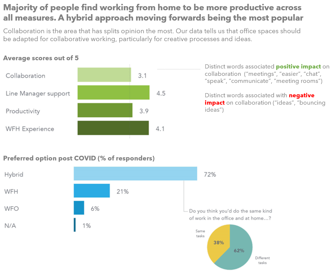
Results
The above image was posted. This shows highly summarized the data from the Your Voice survey. The 3 data visualizations are designed to guide you quickly to conclude a couple of key points:-
- On average most people have found working from home to be better versus working from the office, across the areas we measured
- Collaboration (whilst still better WFH on average) split opinion the most
- Going forwards a hybrid solution is by far the most preferable option. With working from office only being preferred by a very small minority.
- Most people opting for hybrid to get the optimal blend of collaborative working and idea generation when in the office. In combination with the work life balance benefits of working from home.
We also hinted at some of the whys beneath this data and the analysis of the free text data collected alongside the scores (NLP) in the commentary to the right of the main viz.
This image was designed specifically for a Linked In post, therefore very condensed and missing detail.
In the following few subsections I am sharing with you a selection of some of the more detailed slides that were included in pack that went out to all Sykes employees.
Collaboration Impact
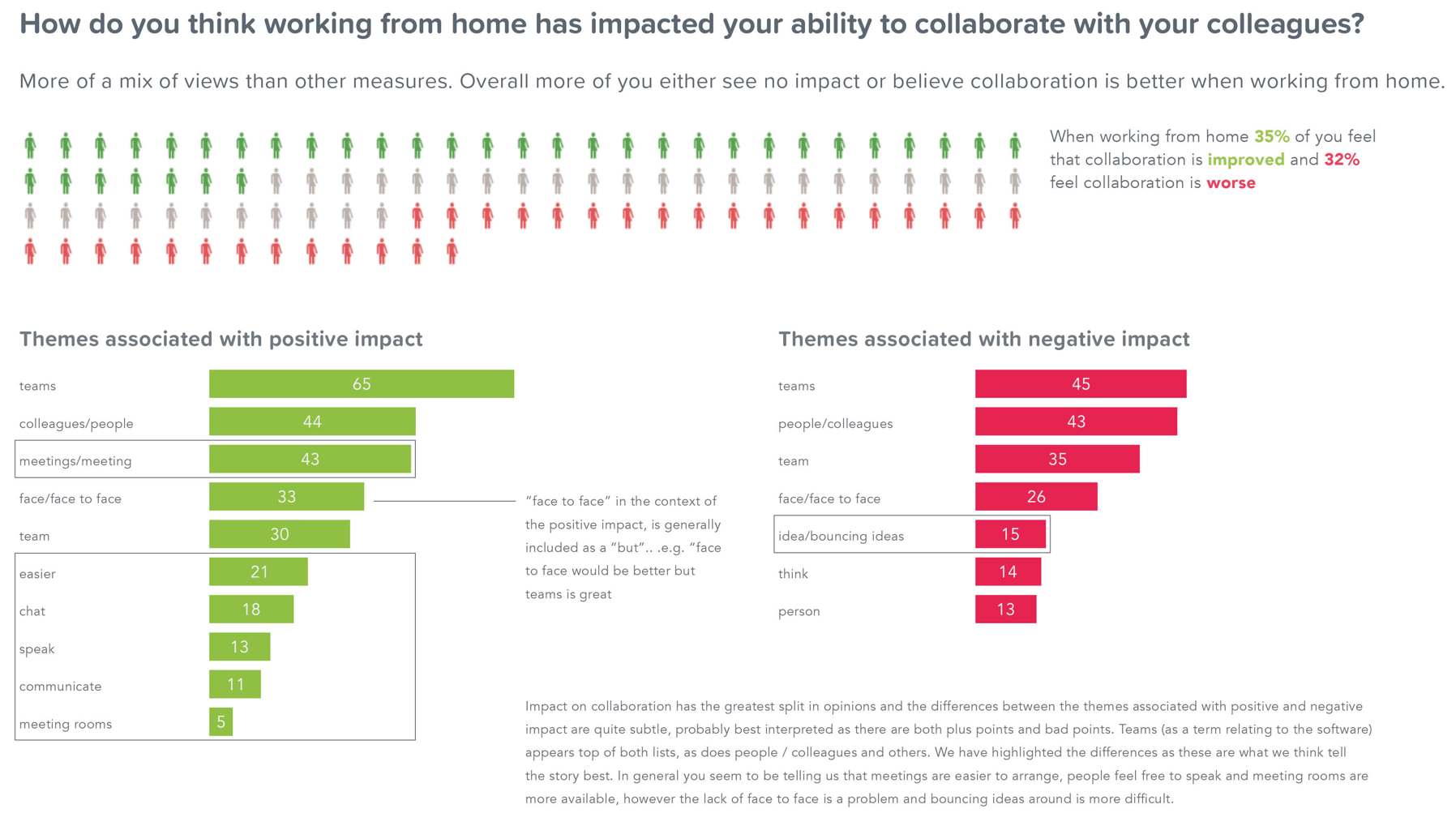 The info graphic along the top is doing the job of breaking down that average to demonstrate the near 3 equal way split in opinion from respondents.
The lower half of the slide is based upon the free text fields associated with the scores to dig into common themes within that text (this technique is known as NLP (Natural Language Processing)). This data has to be interpreted carefully as sentences written in natural language can be quite nuanced. For example "face to face" appears to be associated with both positive and negative impact, however when you dig into this data in most cases this is because of "buts" i.e. "face to face would be better but actually teams / zoom works really well"
The key thing we highlighted in the bar charts are the differences and the inferences we can then make from those. On the positive side we make the inference that meetings are easier to organize, people feel freer to speak and meeting rooms are easier to book. On the negative side we highlight "ideas / bouncing ideas" as this is not included in the positive list and are inferring that is the main theme that people are suggesting is negatively impacted when working from home.
General Experience
Very quickly from this slide you can see that the overwhelming majority of people either found the experience positive or on par with working from the office. Importantly though there are a cohort of people who are experiencing negative impact from working from home.
Moving down to the more detailed bar charts, again using NLP techniques to aggregate and summarize the free text data that accompanied the question, we can see the themes most associated with positive and negative experience.
No huge surprises to see a lot of comments in the positive column relating to time, commuting, work life balance and family life.
Important to note the views of the people though that are experiencing feelings of isolation, lack of support or are working very long hours.
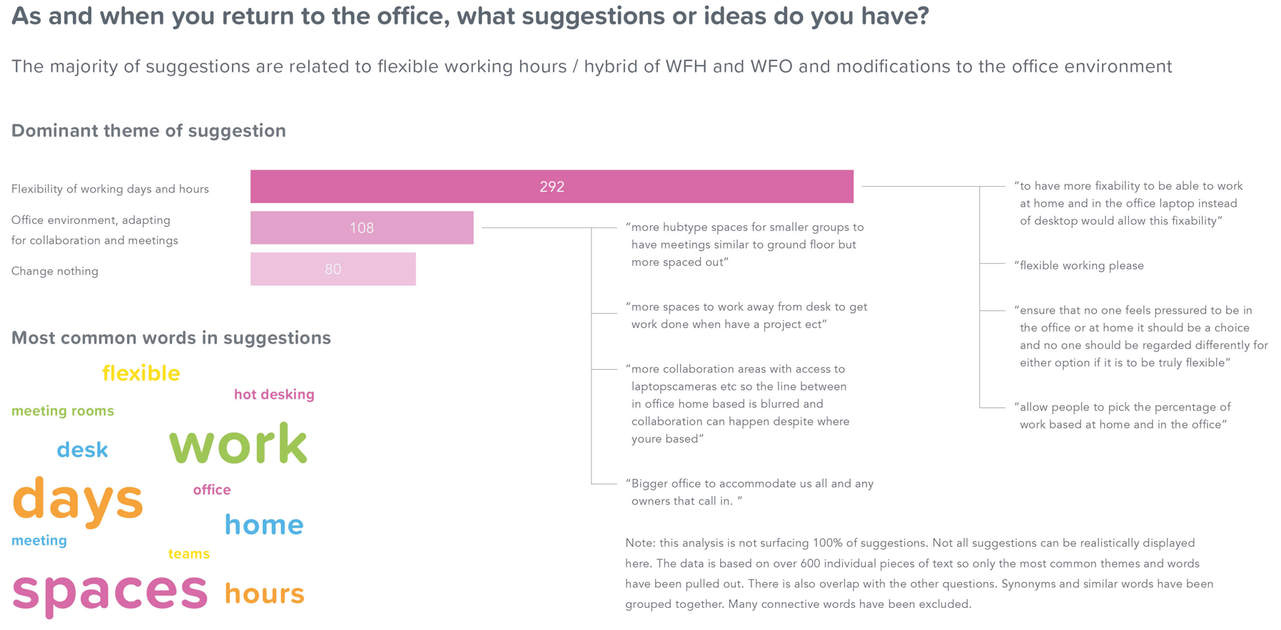
Suggestions
In the last slide of the presentation that I am sharing in this article we are focusing on general suggestions. This slide is based solely on unstructured text data and is quite an open ended question. Therefore to aggregate this we use NLP again but this time allow it to automatically find patterns of words that commonly appear together in sentences and group them into topics, this allows us to identify common themes in the data. The three things speak for themselves.
Worth noting though that the aim of this analysis is not to surface every topic and suggestion but to give an overview of the high level themes and the largest topics mentioned.
How (for the techies)
Once we had the data from the survey, which is a combination of structured (scores) and unstructured text (comments) we ingest the data into Python and used the following libraries:
import pandas as pd
import matplotlib.pyplot as plt
import seaborn as sns
import numpy as np
import nltk

from sklearn.decomposition import TruncatedSVD
from sklearn.decomposition import LatentDirichletAllocation
from collections import Counter

from sklearn.feature_extraction.text import CountVectorizer

from sklearn.decomposition import LatentDirichletAllocation
We then go through the following steps:
Data Prep
The goal of the data prep step is to clean it to:
- Remove "stop words" i.e. "to", "is", "was" etc.
- Remove unwanted characters, i.e. punctuation, slashes any special characters etc.
- Lower casing
def clean_text(text):
'''Make text lowercase, remove text in square brackets, remove punctuation and remove words containing numbers.'''
text = text.lower()
text = re.sub(r'\[.*?\]', '', text)
text = re.sub(r'[%s]' % re.escape(string.punctuation), '', text)
text = re.sub(r'\w*\d\w*', '', text)

return text
Extracting one-grams, bi-grams and tri-grams
This is how we begin to understand common words, pairs and triplets of words. We can associate these back to the score given by the respondent.
def get_top_n_bigram(corpus, n=None):

  vec = CountVectorizer(ngram_range=(3, 3), stop_words= 'english').fit(corpus)
  bag_of_words = vec.transform(corpus)
  sum_words = bag_of_words.sum(axis=0)
  words_freq = [(word, sum_words[0, idx]) for word, idx in
    vec.vocabulary_.items()]

  words_freq =sorted(words_freq, key = lambda x: x[1], reverse=True)
  return words_freq[:n]
Topic modelling
We use topic modelling to automatically identify topics contained within the unstructured text.
vectorizer = CountVectorizer(analyzer='word',
min_df=3, # minimum required occurences of a word
stop_words='english', # remove stop words
lowercase=True, # convert all words to lowercase
token_pattern='[a-zA-Z0-9]{3,}', # num chars > 3
max_features=1000, # max number of unique words. Build a vocabulary that only consider the top max_features ordered by term frequency across the corpus
)

data_vectorized = vectorizer.fit_transform(df['clean_text'])

lda_model = LatentDirichletAllocation(n_components=10, # Number of topics learning_method='online', random_state=0, n_jobs = -1 # Use all available CPUs
                                     )

lda_output = lda_model.fit_transform(data_vectorized)

pyLDAvis.enable_notebook()
pyLDAvis.sklearn.prepare(lda_model, data_vectorized, vectorizer, mds='tsne'pyLDAvis.enable_notebook()
Tableau
Once we have our data we load it into Tableau to create the various visualizations.
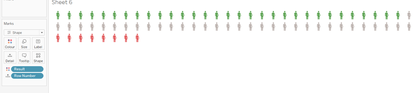
Most of these visualizations are standard so I won't go through the steps for those. However we were keen when we were breaking down the averages to use an info gram that represented respondents and the distribution of them in a none technical way as 90% of people receiving this presentation are none technical, this is why we chose people icons, coloured to represent the responses, e.g.

This is very easy to do in Tableau,
Step 1 - prep your data.

With exactly 100 rows, in the result column are then Good, Same or Bad (the exact words you use is unimportant).
Step 2 - Pull into Tableau and create the first part of the sheet
Drag row number to Detail, change the Marks to Shape, click Shape then More shapes... and find the gender neutral icon.
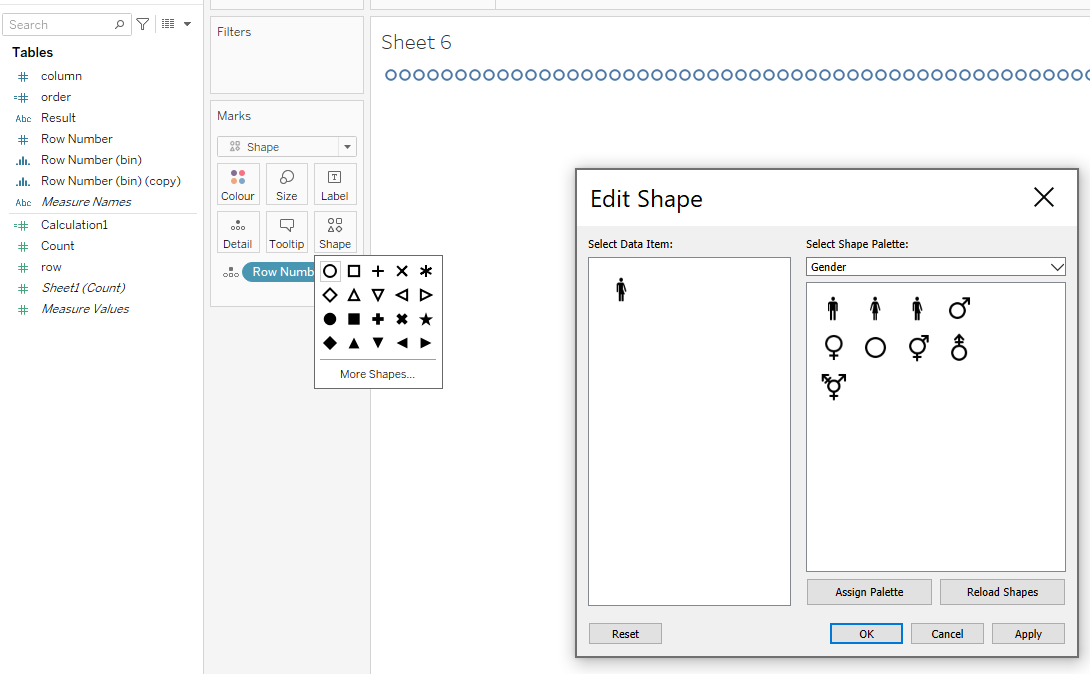
Step 3 - Colour the icons
Drag result to Colour (adjust the colours if required) and resize the icons.
Our final steps in this project were just to pull all of the visualizations together into a presentation and add commentary.